GULFSTREAM PROJECT
BRANDING DESIGN FOR GULFSTRAM AEROSPACE
LIGHTS & DOTS
Given the task of creating a unified branding system versatile enough to be used on all platforms of Gulfstream’s visual media, the design solution reflects key words associated with the company: precision, innovation, symmetry, elegance, and pride.
The design begins with the appearance of bright light forms to signify the Gulfstream employees. Portraying the humanistic side of the company, the lights combine to create lines, which lead the camera around the composition, constructing abstract form. These forms signify the detailed and complex process behind aircraft engineering, illustrating the effective unification of organic and scientific within the company.
The design begins with the appearance of bright light forms to signify the Gulfstream employees. Portraying the humanistic side of the company, the lights combine to create lines, which lead the camera around the composition, constructing abstract form. These forms signify the detailed and complex process behind aircraft engineering, illustrating the effective unification of organic and scientific within the company.









GRADIENTS & SHADES
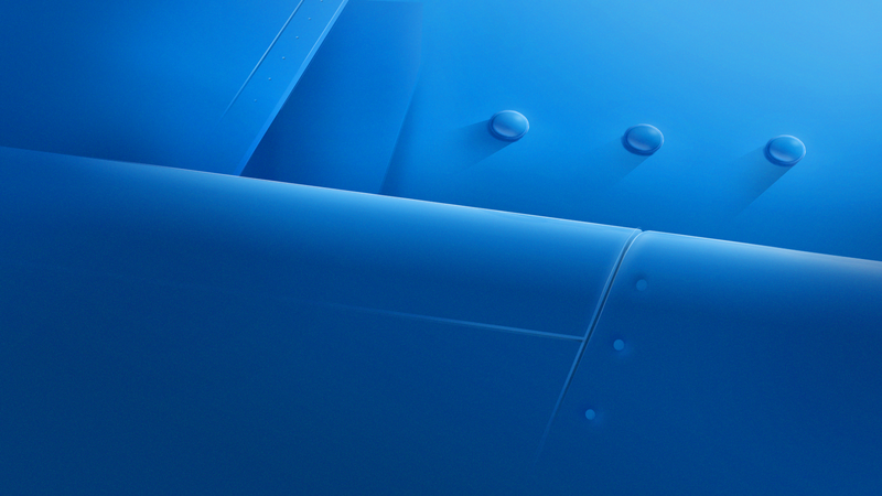
Using primarily gradients and shades, the treatment feels unrestricted with the lack of boundaries between colors – it is limitless, infinite, and therefore, boundless. By using gradients and shades to create form, the style captures the elegance and sophistication of Gulfstream planes while maintaining a sense of comfort and lightness, speed and performance.
Gradients are also synonymous with the sky in all its sublimity, whether it is a sunrise or a sunset.
Gradients are also synonymous with the sky in all its sublimity, whether it is a sunrise or a sunset.










Lower Third & Donut Design
Credits:
Professor:
Austin Shaw
austinshaw.com/
Creative Art Director:
-1-
Daniel Uribe
duribe.com/
-2-
Audrey Yeo
audreyyeo.com/
Animation
-1-
Scottie Lim
scottlim.com/
Judy Mo
judymo.com/
Morgan Fromme
morganfromme.com/
-2-
Audrey Yeo
audreyyeo.com/
Design
-1-
Scottie Lim
scottlim.com/
Daniel Uribe
duribe.com/
Yeojin Shin
helloyoyo.tv/
Jackie Khan Doan
jackiedoan.com/
Morgan Fromme
morganfromme.com/
-2-
Audrey Yeo
audreyyeo.com/
Judy Mo
judymo.com/
Compositing:
-1-
Daniel Uribe
duribe.com/
Judy Mo
judymo.com/
-2-
Audrey Yeo
audreyyeo.com/
Yeojin Shin
helloyoyo.tv/
Sound Design:
Timothy Preston
timprestondesign.com/
Savannah College of Art & Design
Gulfstream Aerospace


